PPC landing pages are something that many businesses struggle with.
While landing pages seem simple enough in theory, they often become less-than-ideal in practice.
One reason for this disconnect between intention and practice is that many different departments can get involved in landing page development — each with its own agenda.
Maybe product development wants to use the landing page to promote its cool new device.
Customer service wants to use the landing page to show off its beefy warranty plan.
IT wants to use its usual web template.
And legal wants to make sure that the company’s policies are front and center.
The list goes on and on.

And you, as your company’s paid search expert, want to use it to get prospective customers to convert!
Before you know it, you end up with a landing page that’s trying to do 10 different things and is doing none of them well.
To help you avoid this kind of situation, I’ve put together a list of landing page dos and don’ts — starting with the don’ts.
Landing Page ‘Don’ts’
1. Don’t Make One Landing Page Do Multiple Jobs
As alluded to above, when a person lands on your landing page, you want them to do one thing: convert!
In B2C, that might mean buying your product or signing up for your service.
In B2B, that might mean signing up for a webinar, downloading a product sheet, or submitting an email address for more information.
And that’s it!
What you don’t want to do is invite the prospect to convert … and take a look at your new service offering … and read a blog post … and then learn how to contact you … and so on.
To do this well, that might mean creating a bunch of landing pages, each with its own distinct purpose. While that might sound scary, it can also be worth your while.
Even having five to 10 landing pages is exponentially better than only having one or two.
Besides, once you have a design template for your landing pages, creating a few additional ones shouldn’t be that laborious.
2. Don’t Include Distractions
You want to make sure that your path to conversion is free of distractions, such as the links and buttons found in navigation bars, footers, sidebars, etc.
When you include links or buttons to other pages on your site (or worse, external sites!), you’re inviting the prospect to diverge from your carefully laid conversion path and go elsewhere — and possibly not come back!
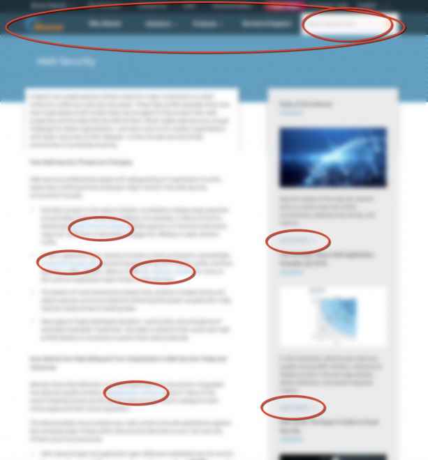
Here’s an example of a landing page with many distractions (excerpt):

I’ve blurred the content for anonymity but circled some of the distractions included on the page.
As you can see, the page has two navigation bars at the top, a search box, a sidebar with links as well as links within the main body.
What you can’t see in this partial screenshot is a footer that contains 40-plus links as well as links to social media!
All of these distractions have the potential of pulling your prospect away from your conversion path. Not good!
Landing Page ‘Dos’
3. Do Keep Your Headline, Offer & CTA in Line with One Another
You want to align your:
- Headline.
- Offer.
- Call to action.
Should any one of these three components fall out of line, you’re going to cause confusion and lose conversions.
To help keep things in line, follow the same principles you use to write your ad copy.
- Make the copy about the user.
- Talk about the outcome.
- Emphasize what users will get in return for taking action.
- Most of all, keep things clear and simple.
To do this well, you may need to procure the services of a professional copywriter. Making your copy compelling while keeping it in line takes special writing skills and experience.
Even if you already have a copywriter on staff, make sure he/she is coming at your copy from the perspective of a prospective customer.
When everything is done in-house, it’s way too easy to fall into “insider speak,” which won’t resonate with your prospective buyers.
4. Do Put Effort into the Design & Images
While your landing page copy is important, your landing page design and imagery are just as important.
You want the design and imagery to support — not undermine — what you want the landing page to do.
For example, if you’re using the landing page to sell a jelly bean, you need to have a picture of a jelly bean on it!
In other words, you need to use images that are relevant to your offer.
This may sound simple, but it doesn’t always happen.
Other design items, like a CTA button that really pops, can also make a big difference in conversions.
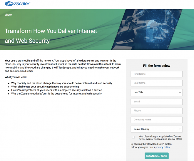
For example, here’s a landing page from Zscaler that uses a simple and clean design to support conversions:

5. Do Show Your Product in Action
With many of our clients, we’ve found that showing their product or service “in motion” can a have a tremendously positive impact on conversions.
One of the best ways of doing this is through videos.
Nothing can explain or show off a hard-to-describe product or service better than a video.
But just because you have a video or two, that doesn’t mean you should automatically add it to your landing page.
As with still images, videos need to be tightly relevant to the purpose of the landing page.
6. Do Test Trust Signals
Trust signals can tip undecided prospective buyers from “no” to “yes.”
These signals can include written testimonials, video testimonials, trust seals, and more.
You don’t have to have dozens of them. Even one or two good ones can make a real difference – especially if your brand is a bit shaky or less well known.
This might not be something that every landing page needs. But it is definitely something you should test!
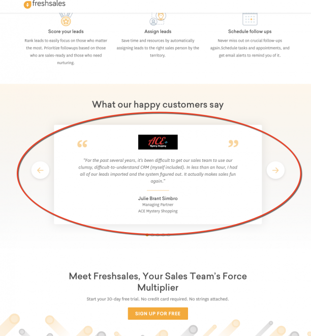
Here’s how Freshsales uses testimonials on one of its landing pages (excerpt):

7. Do Leverage the Thank You Page
Don’t forget to say thank you!
It’s not only the polite thing to do, but it’s also something you can leverage. So go beyond a simple thank you pop up box!
Instead, create a separate thank you page that offers more value. Place some of those links and resources you wanted to include on your landing page but had to remove to keep it clean.
Just because you’ve already gotten what you wanted (a conversion) that doesn’t mean you have to bring the conversation to a close.
8. Do Stay Open to New Possibilities
When you suggest major revisions to existing landing pages — or suggest creating entirely new ones — you might get some pushback.
I understand this impulse. Often, companies have gone through a long collaborative process to put their landing pages together, and it’s alarming to think about redoing them.
If your company can’t stomach a full revamp, try to push through a few of the most critical changes. Maybe the results you get from those changes will give you the data you need to push for further revisions.
Looking for more good landing page examples? Check out these five PPC landing page examples collected by Greg Secrist and these five mobile landing pages collected by Brad Smith.
You Still Need to Test!
While I’ve given you some landing page dos and don’ts here, you still need to test these ideas to see how they’ll work in your PPC accounts.
We’ve all had the experience of things that should work in your account not working and vice versa.
So while what I’ve described above are best practices, don’t take my word for it. Test them out!
This article was originally published in Search Engine Journal.


